Week 10 – Architectural Images / Place & Space

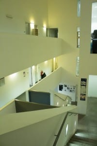
During our week 10 workshop, we were tasked with going out and taking pictures of buildings and other man-made forms of architecture. We mainly focused on areas around campus, specifically the art building. I enjoyed taking photos in this building very much, thanks to how unique it is. Below are a couple of images that I took from inside the building.

Architecture 1Architecture 3

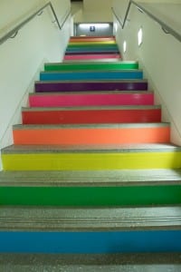
As you can see, I preferred taking my photos in portrait, as I like to get a sense of height within them. What caught my eye was the way the building was set out itself. It was a pure white, windows in places where they wouldn’t usually be seen. The rainbow stairs, while obnoxious, were the first thing to catch my eye upon entering the art building. The vibrant colours in a pure white building set it out from any other location in the art building, so I just had to get a picture. There is one more picture that I have, which I didn’t actually take in the workshop, but I wanted to show anyway.

Architecture 2

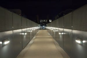
This picture was taken on the art bridge, at night. I originally took a photo of the art bridge during the daytime, in our workshop, but I found it to be uninteresting and too many people were getting in the way, so I made a mental note to come back at night and retake the image, which resulted in a far more interesting photo than the original.
 

Independent Project Intentions Form


Which of the words given in the brief document have you selected, and why?
Division.


What do you want to point your camera at?
Unique and contrasting objects.


Why are you interested in this subject?
I would like to show division in a way that is unexpected, yet works very well.


What do you hope an audience will take from your images?
I hope that the audience will see my images and realise that even if objects have opposite attributes, they can still be brought together to make a good photograph.


What areas of research are you considering to help deepen your understanding of the subject you have chosen?
I have researched still life, taking a look at more famous photographers, as well as more underground ones.


What practitioner(s) or visual resources would you consider to have influenced you? This not have to be photographic.
Over the previous weeks, we have had a look at a lot of Irving Penn’s work. In my own time, I had a closer look at his still life work, which pushed me to explore the topic further.


What support or equipment might you need to achieve your goals?
Equipment wasn’t too much of a problem, I just needed to find objects unique enough, yet easy enough to come by.


Portraiture

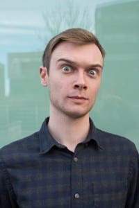
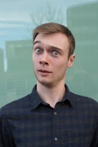
For this task, we were asked to take three pictures of the same, or different subject in a portraiture fashion. I took many photos, struggling to find one that I was actually proud of. Eventually, however, I found a subject that was more than willing to be the subject of my photographs. For my three photos, I used the same person and asked him to show different expressions for each different photograph. These expressions include aggressiveness, happiness, and confusion. In this post, I am going to show them all and describe what techniques I used to take the image, what I like about them and how I took the image. Here are my three images for Portraiture:

IMG_0827-3 IMG_0831-3 IMG_0830

All of these images used the same background, mostly because I wanted my photos to have some form of consistency to them. The background in question is the outside side of a window on the side of the Minerva building, where the blinds are closed on the opposite side. The main reason I chose this is that I thought it was more unique than using a simple, singular coloured background. As you can see, some of the scenes that are behind the camera can be seen in the reflection of the window, behind the subject. I thought this could make an interesting photo.

Something else I wanted to do was have the subject interact with the camera. For this photo shoot, I asked him to pull multiple facial expressions as mentioned earlier. I wanted it to seem that whatever facial expression he was pulling, was directed at the viewer of the photograph. This is so that they feel more connected to the subject. Originally I was planning on using a reflector, but after looking at the photos the first time, I deemed it unnecessary as I believed that they looked fine. The lighting in this picture is from the sky, of which was cloudy at the time of me taking the photographs.

Still Life – The found object

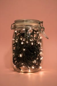
This week’s task consisted of using everyday objects to conduct and create new images, giving them different meanings as well as new views. For this task, we had to take an object that didn’t belong to us, whether it was borrowed from someone we knew, or just found in the street and create something new with it. We were originally tasked with only doing one, I, however, did three. Once I had taken my three images, I had to pick one to upload to my blog. Here is the image that I chose:

IMG_0654

In this image, there are two objects that are not mine. Both the jar and the fairy lights do not belong to me, I borrowed both of these off roommates. The background consists of a bright pink, piece of A2 paper. The reason I thought the jar would be a good idea, was that it could be used in many different ways. I could have filled it with practically anything. I chose fairy lights as while I was deciding what to put in the jar, the lights all cramped up like that looked slightly similar to a night sky in a jar. I decided to hide the battery pack just so it looked more organized and controlled. I tried using multiple backgrounds while taking this image, this including a black background. However it was hard to distinguish the jar, so instead, I used something a lot brighter.

Week 4 Photography workshop

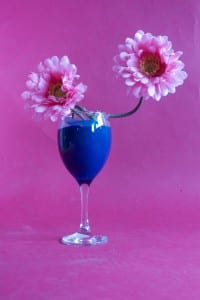
During week 4, our group got to practice using the equipment. This included, the cameras, lights and the tripods. We used multiple objects as well as large sheets of coloured paper to use as the background. For this, I worked with Tyler Elvin, some of the objects that we decided to use included a wine glass that had the inside painted blue, some fake flowers as well as some other bits and bobs. We wanted to take multiple photos of the same objects, but using different lighting. The first thing we took photos of was the previously mentioned wine glass and flowers. Here is the first one, with this photo, we didn’t use too much lighting.

IMG_0659

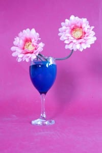
Then, using the same objects, we took another picture, this time using one of the lights to make the image brighter. We also used the same background, just so we could see the difference. We also tested what the picture would look like if we closed the blinds, as well as what it looked like with them open. Below is the second image, where we used extra lighting.

IMG_0660

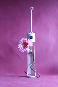
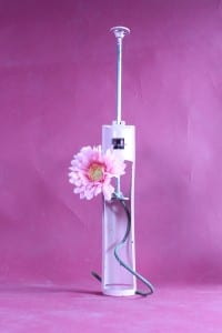
We decided to do the same but with another object, one of brighter colour. Here are those images also:

IMG_0670 IMG_0671